
Brand Guidelines
Brand Guidelines
Offer customers the choice to pay using Zirtue and seamlessly integrate Zirtue logos, banners, and buttons across the user interface to actively engage users about Zirtue Pay as a preferred payment option.
Download Zirtue Assets
Download Zirtue Pay Assets
Zirtue works with many different organizations. To avoid confusion, we have defined a few principles on how our brand identity should be applied in these scenarios.
The Zirtue logo and the partner logo should always be divided by a line. When the logos are placed horizontally, the line should be vertical. When the logos are placed vertically, the line should be horizontal.
Tone of Voice
Transparent
Straightforward, matter-of-fact. No poetry, just transparency. We’re here to be an open & honest space for all members. We carry that belief into our own team and business practices to put extra care and purpose into everything we do.
Kind
Focus on the people and solutions over problems. Empathy is the essence of Zirtue. We believe in cultivating an environment where kindness and patience for all is a priority, and everyone is given understanding on their journey.
Logo
The logo is the primary identifier of our brand. It is employed to quickly communicate our name and identity to the world.
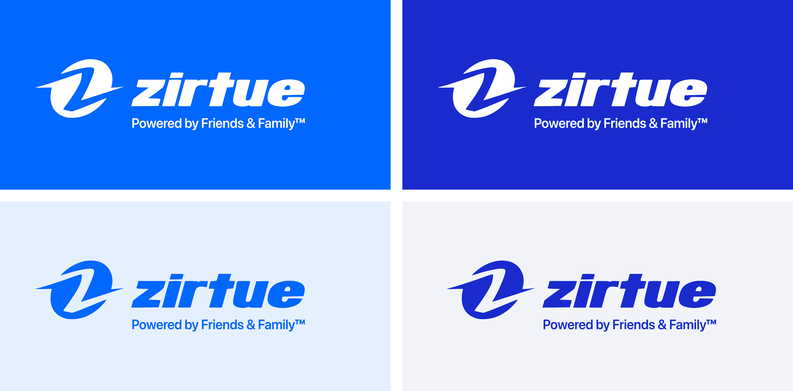
On Color
When combining the logo with brand colors, always ensure there is ample contrast in color pairings. The following examples are approved combinations.
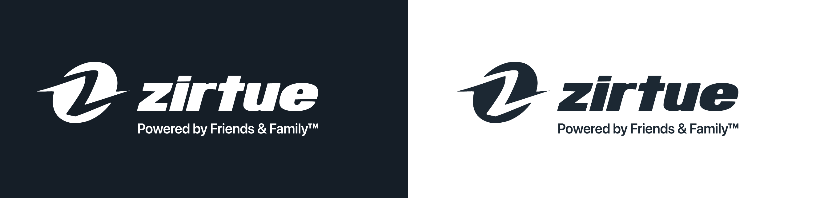
Single Color
Always maintain ample contrast between the background and the logo.
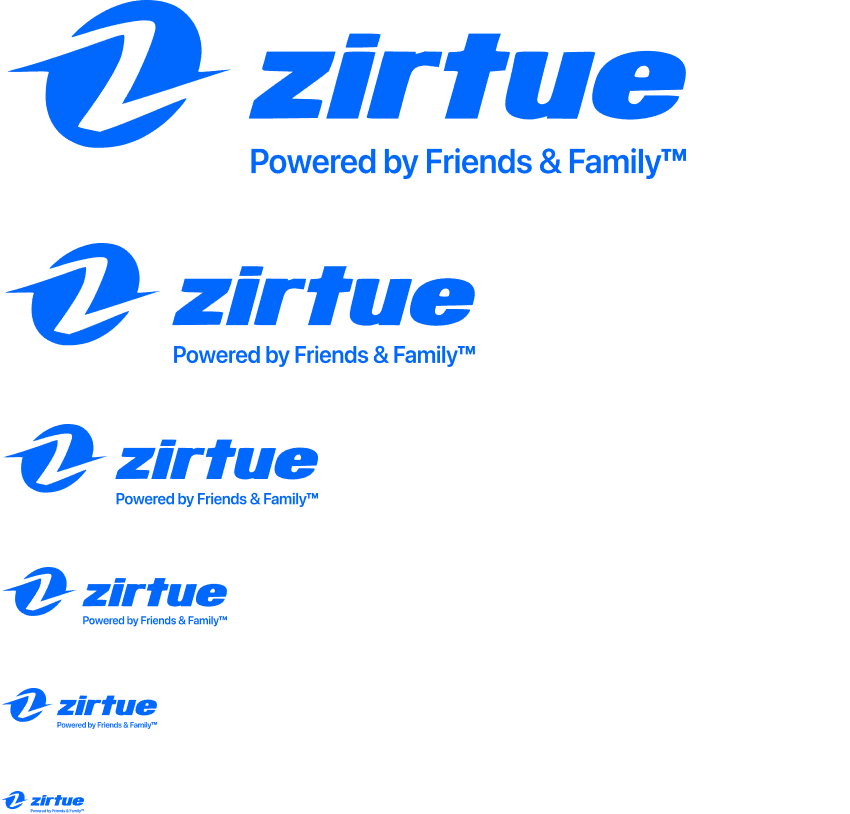
Scaling
The logo has been carefully crafted to read well, even in small sizes. There is no upper limit to scaling, but be cautious with smaller sizes. If legibility is an issue, it's too small.
📘 Recommended minimum size: 20 pixels for screen and 1/4 inch in print.
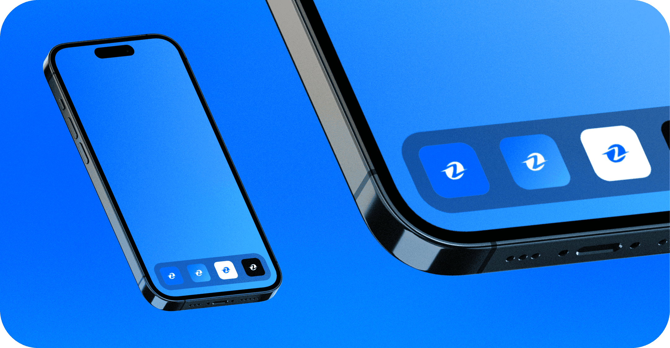
Social Icon
The social icon is the simplest form of identification for our brand.
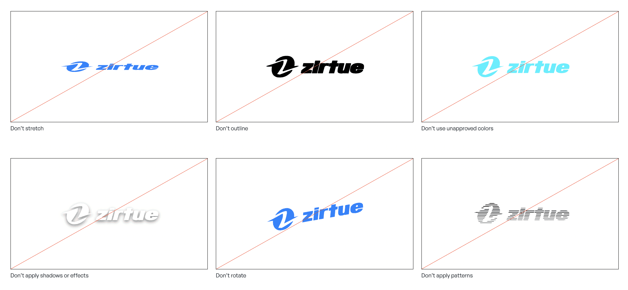
Don’ts
Do not diminish the value of the logo in our brand. Avoid the following treatments.
Updated